Monospaced Fonts and font-weight: bold
I use Ubuntu Mono as the monospaced font on this blog. It comes in several weights: Regular, Regular Italic, Bold, and Bold Italic; but I only include Regular in my TypeKit Kit (to reduce download size).
My syntax highlighting CSS would bold some identifiers to make them stand out, but since I didn’t include a bold weight of Ubuntu Mono, I ended up in a situation that is not well defined by the CSS spec. The CSS2 spec says that “There is no guarantee on how a [user agent] will map font faces within a family to weight values”, while the CSS3 spec says “Although the practice is not well-loved by typographers, bold faces are often synthesized by user agents for faces that lack actual bold faces.”
The result is that the web browsers will just make your font bold, and it will be wider. This works fine with proportional fonts, where the bold weight is usually wider than the regular, but it does not work as expected with monospaced. Monospaced bold fonts should be the same width as the regular weight of the same font.
This is the issue in action:
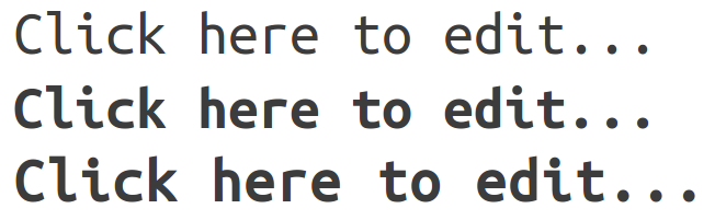
The fonts displayed are:
- Regular Ubuntu Mono
- Bold Ubuntu Mono
- Regular Ubuntu Mono made bold by Firefox
The solution? Either include the bold weight of the font in TypeKit, or don’t use bold monospaced fonts in your code examples. I chose the latter; the bold was too distracting anyways.